Editor's Note: Enjoy this blog from the Custora archive, acquired by Amperity in November 2019.
The "layer cake" cohort visualization is one of our favorite forms of historical customer analysis.
Instead of just focusing on top-line revenue numbers, we color-code monthly revenue based on the "acquisition cohort" it belongs to.
Each color represents the revenue earned from a group, or "cohort," of customers who joined in a given month. (Hat tip to Roberto Medri from Etsy who suggested this visualization to us.)
The layer-cake cohort graph provides three valuable pieces of information:
What % of revenue comes from newer and older users.
How quickly a group of new customers fades away.
Aggregate revenue trends.
A few examples:
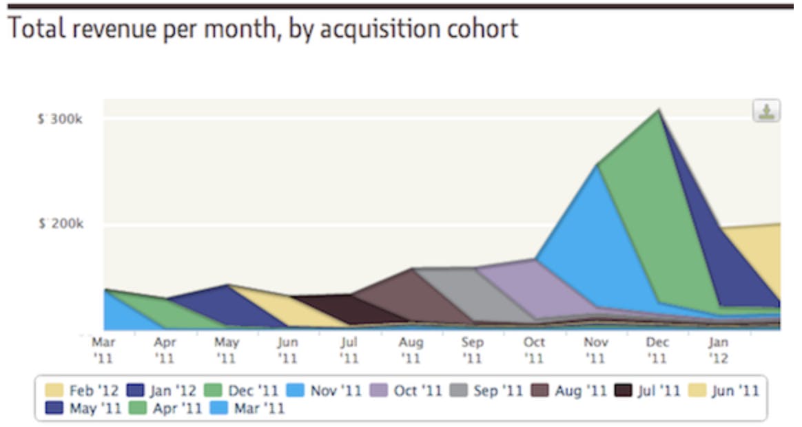
This is a layer-cake diagram of Firm A, a retailer who does not have strong customer retention.
Notice how quickly each cohort fades away. In an average month, roughly 90% of revenue earned comes from new customers.
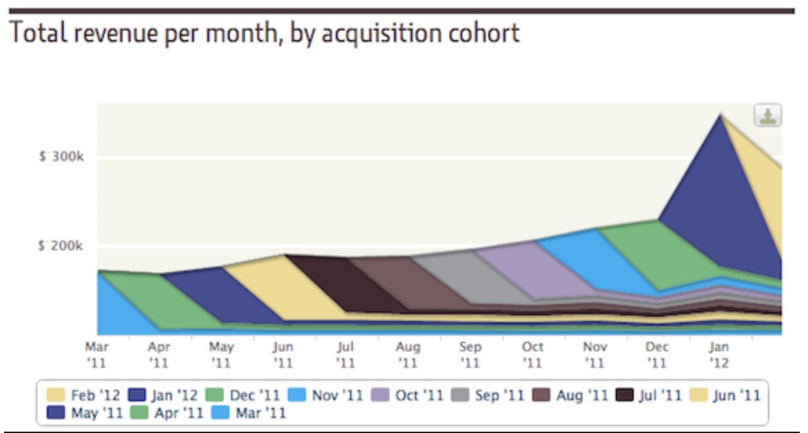
Firm B is a retailer with much better customer retention.
Notice how each cohort band remains strong over time. In this graph, roughly 70% of monthly revenue comes from new customers with 30% coming from repeat business.
The cohort bands shrink down quite a bit after their initial month because customers don't make orders every month - but the customers clearly stick around for a while.
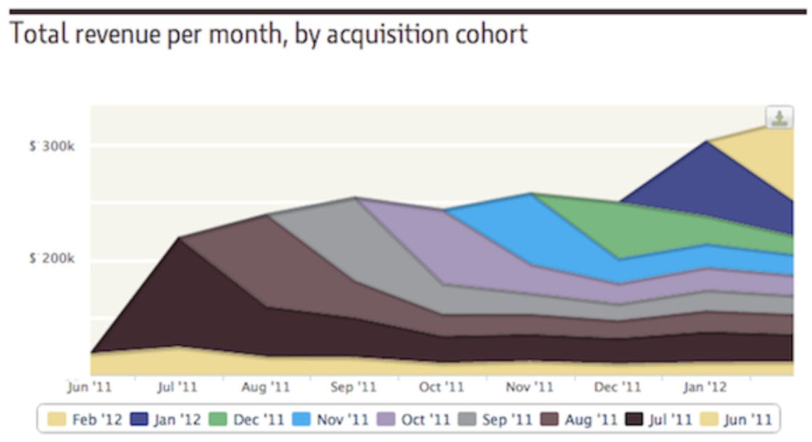
Firm C is a retailer with great customer retention and customers who purchase with high frequency. Nearly 80% of monthly revenue comes from repeat business.
Taking Things Further
The layer-cake graph is an informative way to kick off retention analysis, but it doesn't paint the whole picture.
If we define retention as how long customers stick around, Firm B and Firm C actually have very similar retention. However, Firm C's customers purchase with much greater frequency.
Drawing out retention for users who order at different frequencies can provide further insights.
For example, we might discover that retention revenue numbers are all derived from a small pocket of high-value customers. Or, we might discover that many customers stick around, each ordering once per quarter.
If it turns out that we have a pocket of all-star customers, we'd most certainly want to zoom in on those customers to learn how we can find more of them!
Finally, and perhaps most obviously, the layer-cake graphs don't provide answers on what to do next — they don't shed insight as to how we might improve customer retention.
To change the shape of your layer-cake graph, we need to drill beyond aggregate cohort metrics and home in on individual-level insights. The more we know about specific customers, the better chance we have to keep our customers engaged and happy.